Assignment DG217 – Gooey: soft and sticky
Link to OWinfo: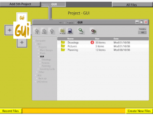
DG217 – Gooey: soft and sticky
Feedback:
DG217 – Gooey: soft and sticky
Attachments:
Final Presentation Gooey: soft and sticky
Reflection:
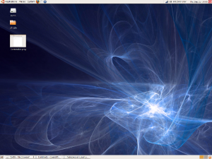
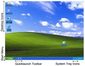
The assignment ‘Gooey: soft and sticky’ provided me the basic principles of designing a Graphical User Interface (GUI). During the assignment I became more aware of the history and definition of a GUI. When looking at the history of GUI’s, it inspired me to take a look at competitors and learn from their faults (Apple, Microsoft etc.). Also the research in differences between the Ubuntu (Gnome) and Windows XP OS’s (as described on page 9-22 of the report) inspired me for using different GUI’s and approaches.
A GUI however is more than a flashy interface or how it communicates with the user. In my opinion it is very important that the GUI understands what the user wants to do. In other words, the GUI should contain an intuitive interface. The use of metaphors can help with that (i.e. desktop, folders, files). Also the use of a clear hierarchy and a flexible navigation will support the user with accessing data. For creating a hierarchy several methods can be used like tabs, pointers, colors etc. Concerning navigation it should always be clear for the user what the structure of the data is, what the current position of the user is and how he can get to his goal. Furthermore a back- or home button should be accessible at all times when the user is lost. In case it goes wrong it should identifiable what the problem is and what the possible solutions are. It should also be clear for the user when the OS or application is currently busy or processing, in order to prevent confusions from the user. Also the information on the screen should be understandable for everybody. Clustering the information on the screen makes it easier for the user to maintain overview. Moreover the screen should contain only the vital information in a concrete way: needless words should be omitted. What’s more it should also be clear for the user what is clickable and what not. Therefore it is better to deactivate incapable options rather than removing it, in this way it will not disorientate the user. Also the use of illustrations and symbols can support the user in understanding the GUI. As a designer I can take this information in mind while designing a new GUI for a product. I also took this information in mind when creating this website.
Designing a GUI is about compromising. It is impossible to design the perfect GUI for every user because everybody has a different background and experience concerning GUI’s. The best GUI’s will work as the user wants it to do. This is not always determined by the experience of the user, but also by the user’s intrusiveness and preferences; which can be visual as well physical: some users prefer to use the mouse to scroll rather than using the keyboard’s arrows for browsing data. Therefore when designing a GUI I should take in mind that it should be easily adaptable by the user towards his personal preferences. In that case the users can make the GUI intuitive by themselves. Therefore as a designer I should not only work with intuition (as an artist does) but should also use knowledge as described in the previous paragraph. I should try not to be too creative when designing; I should try to keep it consistent. Nevertheless the user should keep control of the system, not the OS.
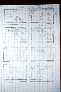
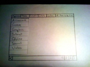
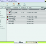
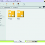
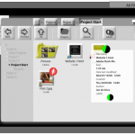
As mentioned before it’s impossible to create the perfect GUI for everybody. However it is possible to focus on a specific target group. For me as upcoming designer this assignment made me aware to focus on the user group very well before actually designing a GUI for a product. Therefore it’s important to do professional focus group meetings and user tests regularly in order to improve the design. It is better to start check visions/ideas and gather feedback in the beginning of the design cycle, rather than testing an almost completed interface.During the assignment we designed a GUI for project-managers and tested it on users. I learned that paper or Flash prototypes are two powerful tools to create an interactive prototype in a relative short time. Click here to view our redesigned interactive prototype in Flash. Down here you can see some pictures of the paper prototypes and the former interactive prototypes.
